Varsom
Crowdsourcing needs a crowd
Client: NVE
Role: Lead/Solo Product Designer
Norway's public avalanche forecasts need local snow data, but developing a crowdsourcing system doesn't matter if people don't use it. For my master thesis I'm redesigning the app to service the users who are curious enough to contribute once, but too intimidated to continue.

Context. For my thesis I'm redesigning Varsom’s avalanche-reporting workflow, which mostly happens through a platform called Varsom/regObs (app + web). Today this happens through a comprehensive digital form. By mapping observer realities and forecasting needs, my hope is to surface hidden friction, and contribute to the well-being of this socio-technical ecosystem to ensure more and cleaner field data, and ultimately safer mountains. Foto: NVE

As-is Form Architecture. Mapping the current information architecture and interaction types revealed over 100 fields and more than 500 taps to complete an observation — something typically done in cold conditions. Lots of work to be done :)
Co-design sessions. I connected with 2 professional observers via Zoom. Both had experience both as forecasters and observers, giving them an understanding of two key stakeholder's needs and pain points. Together, we went through the form and ideated on areas of improvement.

Since mountains have such local weather variation, data models struggle to compete with real people doing real field observations. Observers are like the forecasters eyes on the ground. I've also been conducting interviews with professional observers and forecasters. Foto: NVE
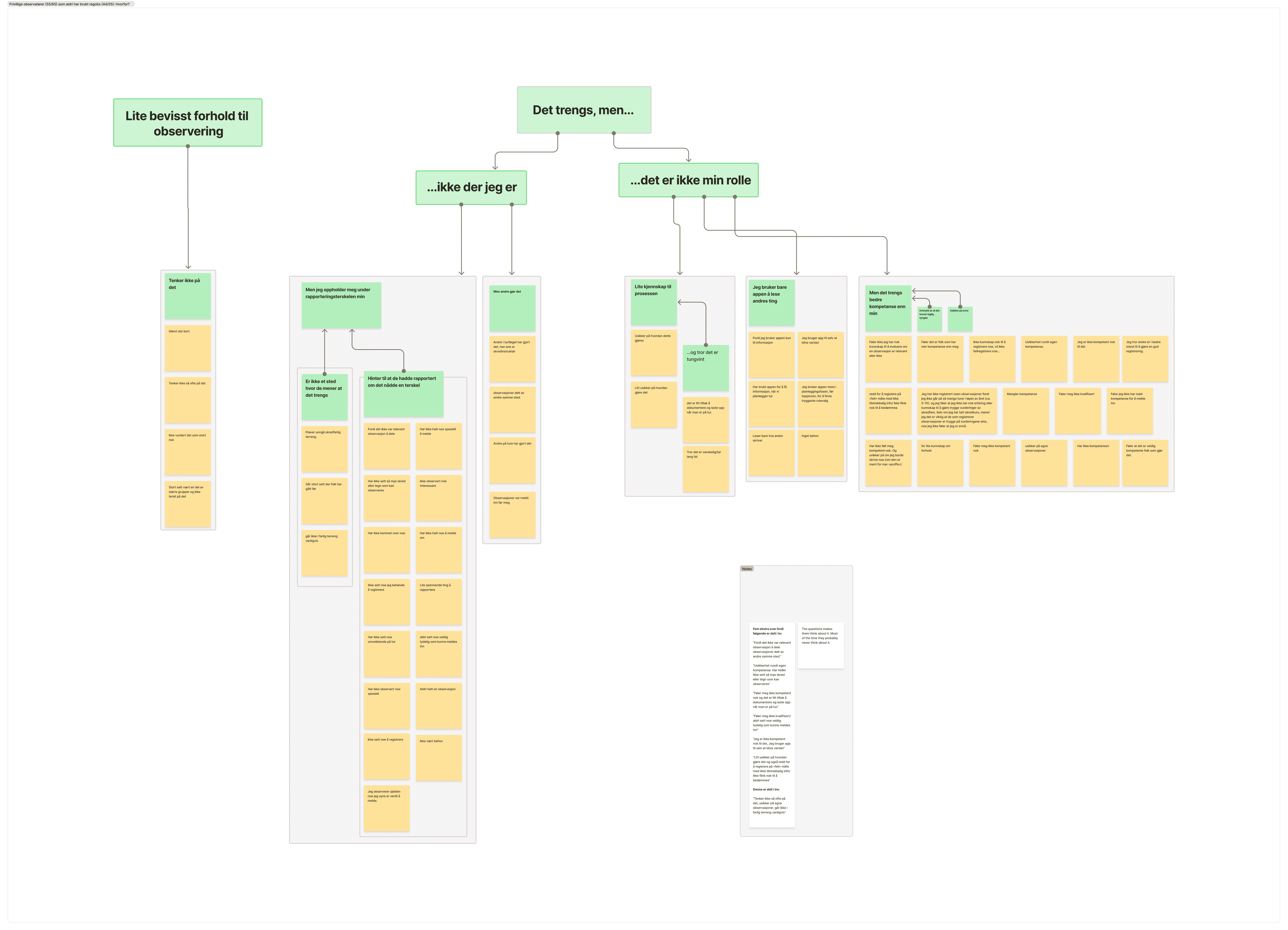
Coding qual survey responses (n=65). Quant questions confirmed the survey mainly reached civilian skiiers. The survey branched to ask this cohort qualitatively why they didn't report observations. Affinity mapping confirmed that is a clear need to recontextualize the avalanche forecasting so that recreational skiiers see the point in contributing.
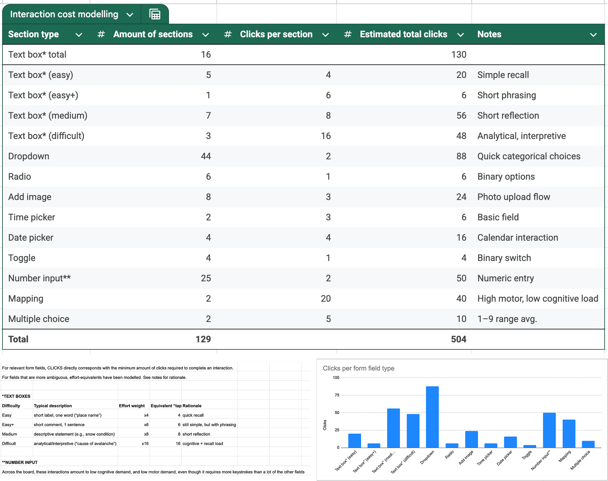
Interaction cost modelling. An estimate of cognitive/motoric effort-per-field. I coded each type of field into "clicks". Some are 1:1 — for instance, a radio button constitutes 1 click. More complex form fields had to be interpreted based on their characteristics. Co-design workshops informed this.
System mapping. Maps and diagrams from discovery phase. This reporting workflow is core to sustain the avalanche forecast in Norway. Since its a socio-technical system, human factors (UX) should be prioritized more.

Thematic Analysis. Currently analyzing interviews (n=9). Some are more dense than others!

New form fields. Initial sketching on new form fields. In theory it should be really easy to reduce the interaction cost by adding or refining the types of form fields. These designs also have the goal of visually tying the reporting to the visuals in the forecast, thereby connecting them conceptually in the mental models of casual users.
Context. For my thesis I'm redesigning Varsom’s avalanche-reporting workflow, which mostly happens through a platform called Varsom/regObs (app + web). Today this happens through a comprehensive digital form. By mapping observer realities and forecasting needs, my hope is to surface hidden friction, and contribute to the well-being of this socio-technical ecosystem to ensure more and cleaner field data, and ultimately safer mountains. Foto: NVE
System mapping. Maps and diagrams from discovery phase. This reporting workflow is core to sustain the avalanche forecast in Norway. Since its a socio-technical system, human factors (UX) should be prioritized more.
Coding qual survey responses (n=65). Quant questions confirmed the survey mainly reached civilian skiiers. The survey branched to ask this cohort qualitatively why they didn't report observations. Affinity mapping confirmed that is a clear need to recontextualize the avalanche forecasting so that recreational skiiers see the point in contributing.
Co-design sessions. I connected with 2 professional observers via Zoom. Both had experience both as forecasters and observers, giving them an understanding of two key stakeholder's needs and pain points. Together, we went through the form and ideated on areas of improvement.
New form fields. Initial sketching on new form fields. In theory it should be really easy to reduce the interaction cost by adding or refining the types of form fields. These designs also have the goal of visually tying the reporting to the visuals in the forecast, thereby connecting them conceptually in the mental models of casual users.
Since mountains have such local weather variation, data models struggle to compete with real people doing real field observations. Observers are like the forecasters eyes on the ground. I've also been conducting interviews with professional observers and forecasters. Foto: NVE
As-is Form Architecture. Mapping the current information architecture and interaction types revealed over 100 fields and more than 500 taps to complete an observation — something typically done in cold conditions. Lots of work to be done :)
Thematic Analysis. Currently analyzing interviews (n=9). Some are more dense than others!
Interaction cost modelling. An estimate of cognitive/motoric effort-per-field. I coded each type of field into "clicks". Some are 1:1 — for instance, a radio button constitutes 1 click. More complex form fields had to be interpreted based on their characteristics. Co-design workshops informed this.
Context. For my thesis I'm redesigning Varsom’s avalanche-reporting workflow, which mostly happens through a platform called Varsom/regObs (app + web). Today this happens through a comprehensive digital form. By mapping observer realities and forecasting needs, my hope is to surface hidden friction, and contribute to the well-being of this socio-technical ecosystem to ensure more and cleaner field data, and ultimately safer mountains. Foto: NVE
Since mountains have such local weather variation, data models struggle to compete with real people doing real field observations. Observers are like the forecasters eyes on the ground. I've also been conducting interviews with professional observers and forecasters. Foto: NVE
System mapping. Maps and diagrams from discovery phase. This reporting workflow is core to sustain the avalanche forecast in Norway. Since its a socio-technical system, human factors (UX) should be prioritized more.
As-is Form Architecture. Mapping the current information architecture and interaction types revealed over 100 fields and more than 500 taps to complete an observation — something typically done in cold conditions. Lots of work to be done :)
Coding qual survey responses (n=65). Quant questions confirmed the survey mainly reached civilian skiiers. The survey branched to ask this cohort qualitatively why they didn't report observations. Affinity mapping confirmed that is a clear need to recontextualize the avalanche forecasting so that recreational skiiers see the point in contributing.
Thematic Analysis. Currently analyzing interviews (n=9). Some are more dense than others!
Co-design sessions. I connected with 2 professional observers via Zoom. Both had experience both as forecasters and observers, giving them an understanding of two key stakeholder's needs and pain points. Together, we went through the form and ideated on areas of improvement.
Interaction cost modelling. An estimate of cognitive/motoric effort-per-field. I coded each type of field into "clicks". Some are 1:1 — for instance, a radio button constitutes 1 click. More complex form fields had to be interpreted based on their characteristics. Co-design workshops informed this.
New form fields. Initial sketching on new form fields. In theory it should be really easy to reduce the interaction cost by adding or refining the types of form fields. These designs also have the goal of visually tying the reporting to the visuals in the forecast, thereby connecting them conceptually in the mental models of casual users.